Views: 0 Author: Site Editor Publish Time: 2025-07-29 Origin: Site
Aluminum composite panels (ACPs) have become a staple material in modern architecture and design, thanks to their durability, versatility, and sleek aesthetic. One key aspect that makes ACPs so popular is their wide range of color options, allowing architects, designers, and builders to achieve the exact look they envision. Whether you're working on a commercial facade, interior wall cladding, or signage, choosing the right color is crucial for both visual impact and functional performance.
However, selecting the perfect color from digital palettes or online catalogs can be challenging without seeing physical samples. This is where creating your own printed color swatch charts (also known as color charts or color sample books) becomes invaluable. This guide will walk you through the importance of color swatch charts for ACPs and provide a detailed step-by-step process for making your own, ensuring your project colors come to life accurately and confidently.
Before diving into how to make your own color swatch charts, it's important to understand why they are so essential:
Accurate Color Representation: Colors appear differently on screens due to varying display settings and lighting. Printed swatches offer a true representation of what the finished ACP will look like in natural or artificial light.
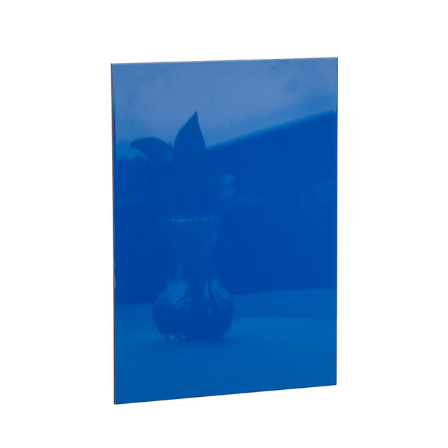
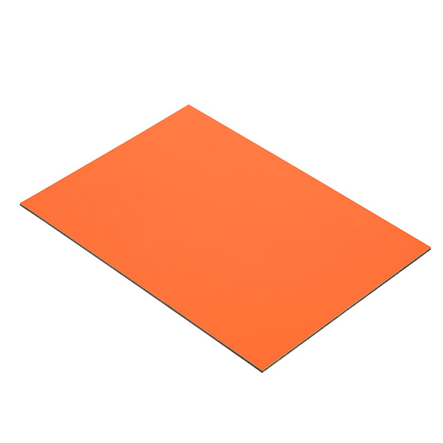
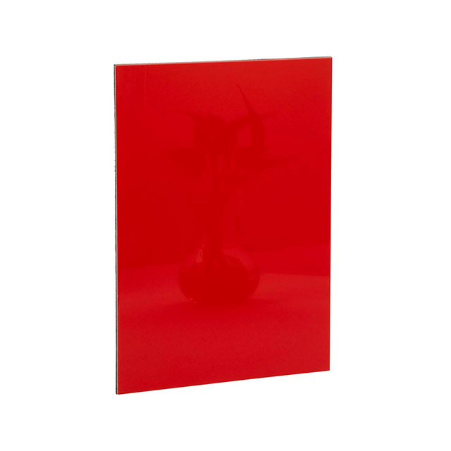
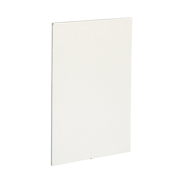
Material Texture and Finish: ACPs come in various finishes, including matte, glossy, metallic, and textured surfaces. A color chart printed on paper can be paired with actual ACP samples to evaluate how color and finish interact.
Customer Confidence: Presenting physical color swatches helps clients or stakeholders make informed decisions and reduces the risk of costly color mismatches.
Design Consistency: Swatch charts provide a reliable reference throughout the project lifecycle—from initial design and ordering to installation and maintenance.
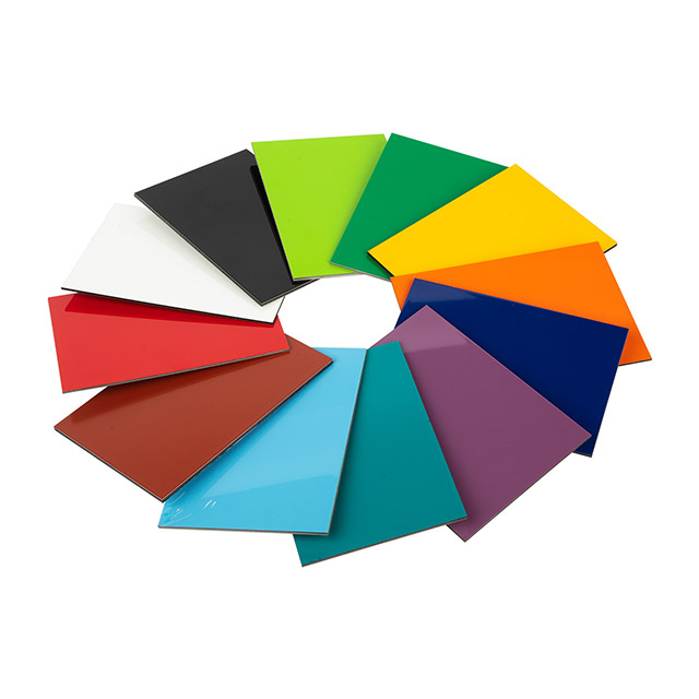
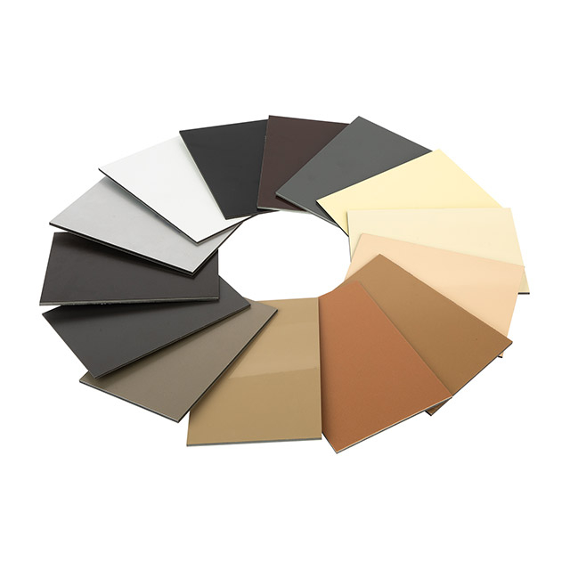
Careful selection and thoughtful organization of colors are key to creating an effective and user-friendly color swatch chart for aluminum composite panels (ACPs). Begin by reviewing the full color palette offered by your ACP supplier, which often includes a wide range of hues—from timeless whites and elegant blacks to vibrant reds, deep blues, and shimmering metallic finishes.
Group by Color Families: Organize the swatches into logical groups such as warm tones (reds, oranges, yellows), cool tones (blues, greens, purples), neutrals (whites, grays, blacks), and metallic or special effect colors. This categorization helps users quickly navigate the chart and compare similar shades side by side.
Consider Usage Categories: Separate colors based on their intended application—exterior panels often require more durable coatings with UV resistance, while interior panels might prioritize softer hues or finishes. Labeling panels as “exterior grade” or “interior grade” can provide clarity.
Include Popular and Trending Shades: To stay current and meet client expectations, be sure to highlight trending colors, such as pastel tones or earth-inspired shades, as well as classic staples that never go out of style.
Account for Finish Variations: ACPs come in various finishes including matte, gloss, metallic, satin, and textured surfaces. It’s important to indicate these finishes clearly on your swatch chart, either through labels or by using separate sections. This helps designers visualize not just the color, but also the visual and tactile quality of the material.
Use Consistent Naming and Coding: Align each swatch with official color names and codes provided by your manufacturer or Pantone references to avoid confusion and ensure accurate ordering. Including both the name and code near each color swatch makes the chart a practical reference tool.
Plan for Expansion: If you anticipate new colors being added over time, design your chart with flexibility in mind. Leave space for additional swatches or create modular charts that can be updated easily.
Start by opening your preferred graphic design software—such as Adobe Illustrator, Photoshop, Canva, or even free tools like GIMP—and create a new document sized to your intended print medium, whether that’s A4, A3, or a custom brochure size.
Design Consistent Color Blocks: Arrange uniform, clearly defined color blocks or squares to represent each aluminum composite panel color. These blocks should be large enough to give a clear visual impression of the shade and finish, allowing users to accurately judge the color at a glance.
Include Informative Labels: Allocate space beneath or beside each swatch for essential details such as the color name, official code (Pantone or manufacturer’s reference), and finish descriptions (matte, gloss, metallic, etc.). This makes the chart both visually appealing and practically useful.
Add Branding and Project Info: Enhance professionalism by incorporating your company logo, contact details, or project name on the swatch chart. This not only reinforces brand recognition but also provides recipients with a direct link back to your business.
Optimize Layout for Readability: Balance the size of the color blocks and text to fit well within the page, ensuring the overall layout is clean, uncluttered, and easy to navigate. Consider using grids or guides to maintain alignment and consistency throughout the chart.
Consider Interactive Elements: If the chart will be used digitally, think about embedding hyperlinks or QR codes near each swatch that direct users to detailed product pages or samples for deeper engagement.
To ensure that the colors you see on your screen match what gets printed—a critical step for maintaining accuracy in your color swatch charts—calibration is essential.
Monitor Calibration: Use dedicated hardware calibration tools such as colorimeters or spectrophotometers to adjust your monitor settings. This process corrects color temperature, brightness, contrast, and gamma, allowing your screen to display colors as accurately as possible. Regular recalibration is recommended to maintain consistency over time.
Printer Profiling: Create or use existing ICC profiles specific to your printer and the type of paper you will print on. These profiles help the printer interpret color data correctly and reproduce colors faithfully. Many printer manufacturers or paper suppliers offer downloadable profiles tailored to their products.
Test Prints: Before finalizing your swatch chart, run several test prints on your selected paper stock. Compare the printed results to your on-screen colors and adjust printer settings—such as color saturation, brightness, or contrast—if necessary. This iterative process ensures the best possible match.
Paper Considerations: Remember that the type of paper impacts color appearance. Glossy papers can make colors appear more vibrant, while matte papers may produce softer, muted tones. Choose paper stock that closely mimics the surface finish of your aluminum composite panels for a more realistic representation.
Print your swatch chart on the selected paper.
Evaluate the printed colors under different lighting conditions (daylight, fluorescent, LED) as lighting greatly influences perception.
Compare printed swatches against actual ACP samples if available.
Make notes on any colors that require adjustment or substitution.
Once satisfied, print multiple copies of your color swatch chart for use in client meetings, design presentations, or on-site references.
Laminate or bind the charts to protect them from wear.
Update your charts periodically as new colors or finishes become available.
Share digital versions with appropriate color profiles for remote collaborators.
Creating your own printed color swatch charts for aluminum composite panels is an essential step in ensuring design accuracy, client satisfaction, and seamless project execution. With careful calibration and thoughtful layout, these charts can bridge the gap between digital color selections and real-world applications, reducing guesswork and miscommunication.
If you're interested in a wide selection of aluminum composite panels and accompanying color charts, Zhejiang Geely Decoration Materials Co. offers an extensive range of high-quality products tailored for various architectural and design needs. Contact them to learn more about their offerings and how they can support your next project with expert guidance and reliable materials.